Sunday, September 7, 2014

Evolution of an Image- Cambrils series


While we were in Spain this last summer, we spent a number of days in Cambrils soaking in the sun, visiting with friends, and playing on the beach.  Good times!  I started trying to paint a sunset we experienced there, and it was just... very very frustrating.  I'd just taken the Bjorn Bernstrom workshop a week earlier, and I just, honestly, had no control.  In an effort to be an honest artist, I thought I'd share some of the (really) terrible paintings I did at first, as well as where the image went, as I began to get a handle on Bjorn's methods.

This is the first batch of very rough sketches.  All done on a quarter sheet (15" x 11").  I played with different formats and approaches, and learned to figure out the order and timeliness I was going to need to use, if I was going to get have any sort of control.  One of Bjorn's pieces of advice, that "Patience is one of the most important things for a watercolor artist to control" was very true.


I left it like that for about a month, and only came back to it in the States.  I decided to shrink the format to an 1/8th sheet (7.5" 11").  A good choice, as I burned through a lot of iterations, learning the techniques, and thinking about composition and color schemes.


I began to recognize that I really wanted to show that long stretch of horizon more, so I changed the format to little skinny 1/8 sheets (5.5" x 15"), and began to explore different approaches- more chromatic, less chromatic, darker values, more land being show, less land being show, white boat masts, etc.


 `
It was only when I got to this one though, where I removed the clouds and had the darker masts, that I felt like I was approaching what I was looking for.  I also began to model the mountains, which provided a greater sense of light and directionality.


I'd like to do more iterations with the clouds again later,  but I think I need a taller format, to better balance the composition.  For this dimension, I want to focus on the horizon and the waves.  So, I took that last one and blew it up to a full half sheet (11" x 30") and got the final image-


Evolution of an Image- Granada series


We were in Granada this summer.  I did sketches of the Alhambra, and took many pics.  Above is the final painting (11" x 30"), and below is the first sketch, done from the roof of our apartment-


I tried painting it while I was there, but was dissatisfied with the results.  I got these quick 1/4 sheet sketches done.


Too literal for my tastes, and got none of the "feel".  Also not enough variety in value.


 Pure color, really, but I liked it better.  Still, it didn't look much like Granada.  Had more "feel" to it though, IMO.

Once we got back to the States, I started up the series again, here and there, over the month of August.  I got these sketches.


 This one seems better to me, as I'm beginning to get a value range, and use more neutrals.  Still very very loose though.

I ended up deciding that I wanted to see more of the long horizon I liked so much in the original sketch, so I altered the format.  I also started to shrink things, to help me reduce the image down to more essentials.  It all seemed too busy.  So even though these 2 below are 15" long, they're only 5.5" tall, as I went from the 1/4 sheets above to long skinny 1/8 sheets below.

 Eh.  Format's better, but it was time to give up the super-chromatic stuff.

Hey!  Ok, This is starting to seem like something interesting to me.

I took that last semi-success and did a slightly bigger 1/4 sheet- 7.5" x 22".  I varied the colors more, and focused again on that midground that I liked so much.

OK! I liked this one.  

Although, interestingly enough, it started out as a failure.  I wasn't controlling the colors enough and various edges were blurring and mixing.  But once I added in a glaze of shadows, I really enjoyed the varied background those "mistakes" provided.  Some spittle and droplets of water later, and .... voila!  

I decided to grow the image and paint a 1/2 sheet (11" x 30"), something I'd wanted to try for a long time.  I ordered a new, extra big sheet of Gator Board for my backing, and got it in the mail a few days later.  Sat down to paint it, and I was finally well versed enough with the image, that it seemed almost playful. This photo is a little more yellow than the original, but it gives the appropriate sense.


Quite a journey!  :)


Monday, September 1, 2014

Evolution of an Image- Mare Island watercolor series


Over the last week, I've posted a series of painting on Facebook that were inspired by a spit of land on Mare Island.  Today, I'm collating them here.

Most of these images are small- 1/8th sheet (7.5" x 11" or 5.5" x 15")- but I've found this the best size for me to iterate things with.  1/8th sheet is just big enough to compose something on, but no so big I get lost in the details.  I don't worry about messing up or wasting paper either- I've got 7 other sheets available.  What this has really allowed me to do is iterate with abandon, try stuff out, experiment, and not worry to much about whether I was successful or not.  They were all "tests" anyways, right?


I did this first one in Bjorn Bernstrom's workshop (which I'll be posting about later).  It's actually quarter sheet (15" x 11").  I loved the dark blue greens, but it's really very raw and shadows were a bit "chunky" for me.  I was looking for cleaner washes.


Then I did these next two ones.  1/8th sheet.  Playing with wet into wet techniques, deliberate back runs, and figuring out the technical sequence I needed to use to get the paint to do what I wanted.


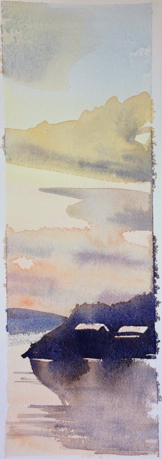
The more I painted it, the more I wanted to play with the sky.  So I opened it up to vertical 1/8th sheets, and got these.  It's hard to keep that back bleeding, wet into wet stuff in order!  Took a couple of tries.


After that, I began to "grow" the composition. I felt like I was getting some sense of control over the backbleeds and the composition.  I wanted to stretch the image vertically more and more.  This next one was a vertical quarter sheet- (7.5" x 22").