I've had a lot of practice over the last few months with painting things on a large scale, particularly things I have no experience painting-- as in, I'm becoming used to being ignorant!!-- so I sat down and researched a bit about what poppies look like, what their shape is, color, etc. before I started painting. I noted to Kate how, when I was painting the tree trunk and leaves in mural downstairs, that I got to a point where it was clear that I didn't know what type of tree I was actually painting, and that that lack of specificity was affecting my ability to paint something that felt real. I didn't want to repeat that fact. So, research first.
I've also learned that a bit of trial and error, error being the key word, is going to be necessary when painting something new. So, I planned on NOT painting all the poppies at once, but only giving it a go on a few. I set about painting three poppies based on some images from some google searches I did. I got these featured in the pic below, and ended up not being satisfied after 2 hours or so of work.
I kept trying to figure out how to get that experience of light pushing through a semi-transparent object (like a petal) and creating shadows on a closer petal. Wow, that's difficult! The major issue, IMO, was that I was adding white to my orange mix, but this came off as an opaque "peach" color. I also think that the images I chose to start from were too abstract. I couldn't tell they were flowers. I couldn't see "into" them.
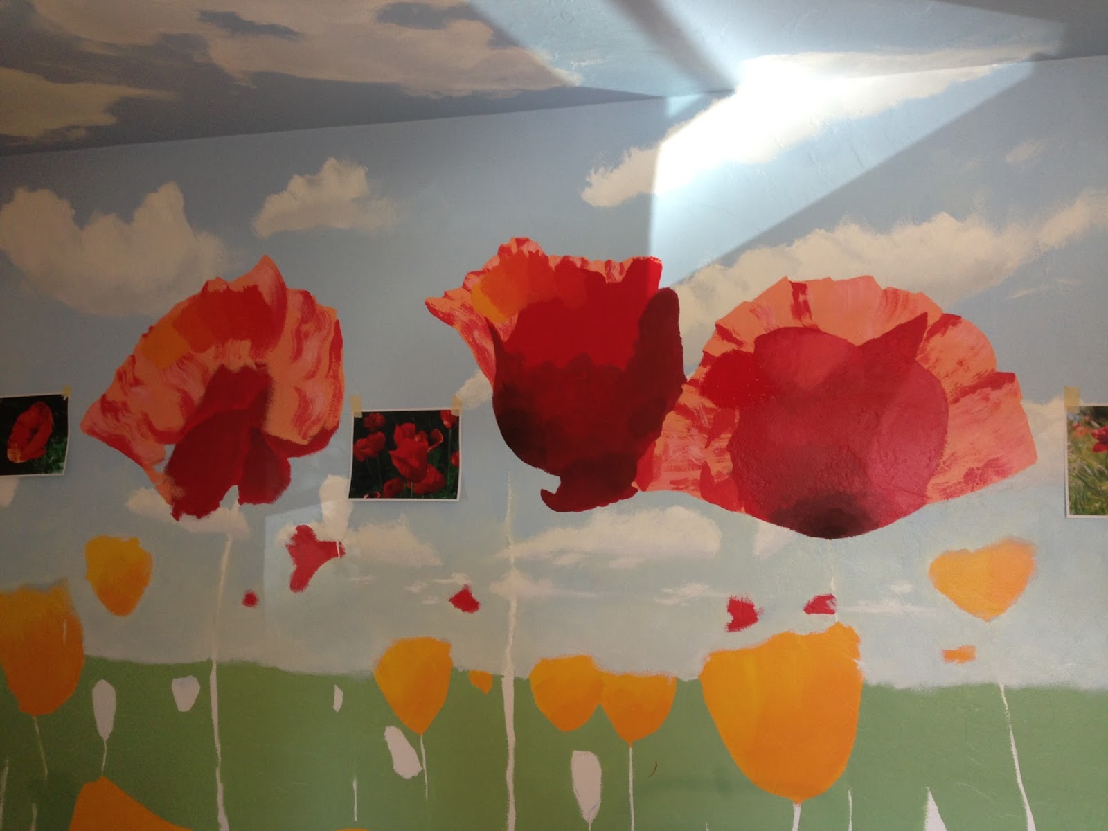
So, a few days later, I did more research, found alternate images to cull from for inspiration, printed them out at Kinkos with rich, full color, and then came back home, taped them on the wall, and proceeded to completely repaint over the flowers I'd done, blocking in the new shapes. That gave me this-
When I came back to the poppies a few days later, I decided that sunlight, being yellow, should make the poppies more orange where sun was pushing through, and the shadows more purple than brown as the contrasting color. These new ones also had a more open shape, which allows us to see "into" them. I think they read much better now. Altogether, including messups, something like 8 hours on these 5 poppies.
But I really feel like I've crossed some sort of border!! I can see the end coming now. I think getting these true "physical" object in there, with a denser value, is helping me see the image more clearly. I'm very excited to get the grass, with all it's messiness and shadows on here soon. Then we can really cross that horizon line, and start bringing the composition together.
Again, this is where I've ended up so far. Something like 35-40 hours total so far, but lots of learning in that number! :D


.JPG)


