Sunday, September 15, 2013

How to Paint a Mural- Step Eight- What does sunlight pushing through a flower petal look like?


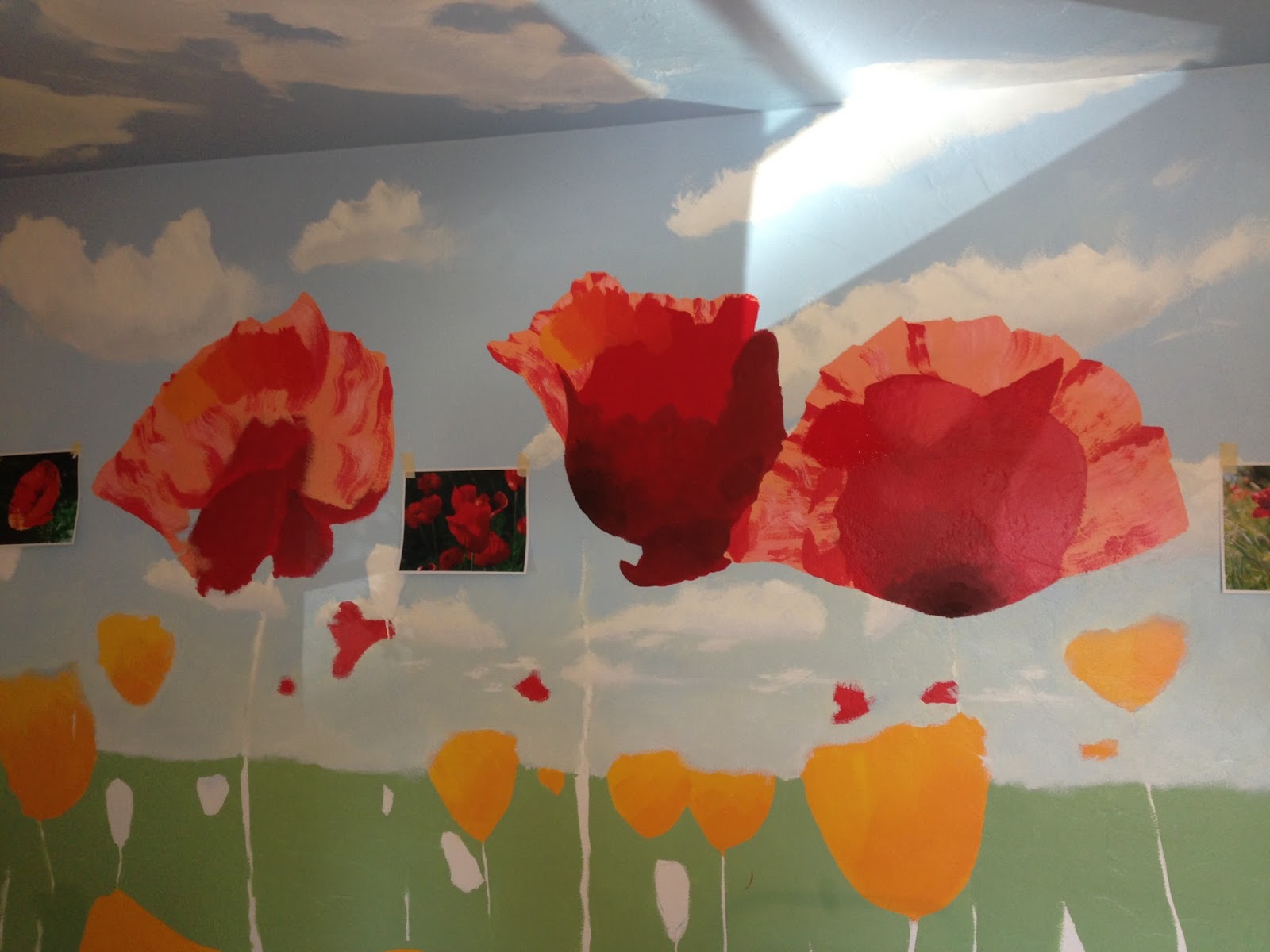
Late last month I did get to do some new work on the mural.  I focused almost entirely on the existing poppies.  What we've got now is this--


something which I'm much more satisfied with.

Why did I come back to the poppies again, for what was, I believe, the 3rd time?  Well, I was still not entirely satisfied with the look of the poppies back in July/ early August, because--
1) there just wasn't that sense of being being "illuminated" and slightly transparent to them, the way a thin petal is with sunlight pushing through them,
2) everything looked very opaque, very dense, and
3) the form still read very flat, rather than rounded and three dimensional.

I had tried to get that sense of transparency in the first attempt, by adding white to the red paint to lower the value, but this just gave me a paler peach color that still looked opaque.  I liked the affect of the shadows, but everything became very abstract, and the object didn't really read easily enough as a poppy.  What I got was this, for those who don't remember that post from back in May  ;) --


The second attempt included changing the actual form and position of the flowers, so that they could be more "open"-- thus allowing a person to see "inside" them and making them more easily readable as a three dimensional object.  It also included pushing the color to a purer red-- poppies are, in essence, very saturated.  Things read better, but there still wasn't that sense of sunlight, of the luminescent, transparent nature of a petal.  Here's what that stage looked like-


But then I saw this image


while browsing some watercolor materials, and it struck me-- sunlight is yellow, and thus yellow is the color I should be mixing in the red, and in much greater quantities than before, to get that luminescent quality I was aiming for.  Towards the end, I got daring, and did some bristley, dry-brush work using pure yellow for the backlit veins, and pure red for the shadows in those same areas.  I also decided to add some white to the poppies for glare highlights and some black to them as well, for those little dots some poppy petals have on them, as well as for the seeds.  Partly I did it for representation, but I also did it to stretch the value scheme some, to give a fuller range.  What I came out that experiment with was this--


Once I'd finished it, and felt like it really finally was starting to work, I wondered at the "why" of it.  It's something I'd like to understand better so I can perhaps replicate it in the future/ apply the knowledge generally.  What occurred to me was that the yellow was appearing lighter in value in the painting, even though both it and red were pure chromatically.  Here's a black and white image of one of the poppies that shows this--


Basically, the yellow streaks appear "lighter/whiter" in black and white, and the red streaks appear "darker".  I did some research, and found out that yellow actually is a "brighter" color on the value scale.  It has something to do with the way it reflects light waves and what our eyes are made to see.  Someone actually shared this really interesting image illustrating this point in a conversation I had on the WetCanvas forum--


The short of it though is that by mixing more and more yellow into my red, I got it to appear both
1) lighter in value/ more washed out, so to speak and
2) more luminescent, as if the petal was "glowing" with light (the way it looks when backlit by sun).

My hope is that I'll be able to apply this knowledge to the grass when I break into it soon.  I've penciled in the general shapes, and how they're going to be overlapping the existing flowers, so I hope I'll get to it soon!

So far, the math is something like--
5 hours prep, drawing concept image, sketching on the wall, and blocking in forms
20 hours on the sky, painted  4x
10 hours on the clouds, painted 2x?
15 hours on on the poppies, painted 3x

15 hours on grass??
15 hours on yellow poppies
10 hours on going back over stuff??? --> i.e. insane desire to learn and improve perception/ reproduction of the natural world to (by most standards) a meticulous level of detail

Of course, an artist is rarely satisfied, and I've since pondered a few additional things I'd like to explore on the painting-
1) What's the color of glare?  First I thought pink but that wasn't right.  Then white, but that hasn't played right either.  Finally, I tested a bit of pale yellow, but I didn't like that either.  I've just not been able to get it right.
2) I feel like there ought to be more cast shadows from the poppy petals on the upper left down onto the poppy petals themselves on the lower right, to get that sense of directional light.
3) I feel like the clouds that are closest, and most directly above, ought to have whiter whites and darker darks.   I like the way the distance reads, but I think I could get more "pop" out of the closer ones.

We'll see though.  Sometimes, you've just got to push forward, or you never finish anything...  ;p


Tuesday, August 20, 2013

Watercolor- View from a Window

I worked on this the other day. Had some fun. The paper is Strathmore's 200#, so what's nice is that it costs a lot less than 300# Arches paper, but also requires a lot less prep than normal 140# paper. I work really wet, so I normally have to wet and stretch my paper with staples, etc on my board-a laborious, slow process that often stops me from getting painting because it takes too long. But with this stuff, I was able to just tape it down the board and get working. In the end, there was some buckling, but not much, and it dried very tight. So,success!
 
Additionally, the paper was big- 2' x 3', I believe, or 2' x 30". It was really fun working big. The vertical lines in this were originally truly upright, but I'm working from a snapshot, and there were some issues with things digitally. So, it is what it is here. Oddly, as it's rather abstract, I like it in both orientations below. :)


Tuesday, August 6, 2013

How to Paint a Mural- Step Seven- What do red poppies look like?


I've had a lot of practice over the last few months with painting things on a large scale, particularly things I have no experience painting-- as in, I'm becoming used to being ignorant!!-- so I sat down and researched a bit about what poppies look like, what their shape is, color, etc. before I started painting.  I noted to Kate how, when I was painting the tree trunk and leaves in mural downstairs, that I got to a point where it was clear that I didn't know what type of tree I was actually painting, and that that lack of specificity was affecting my ability to paint something that felt real.  I didn't want to repeat that fact.  So, research first.

I've also learned that a bit of trial and error, error being the key word, is going to be necessary when painting something new.  So, I planned on NOT painting all the poppies at once, but only giving it a go on a few.  I set about painting three poppies based on some images from some google searches I did.  I got these featured in the pic below, and ended up not being satisfied after 2 hours or so of work.


I kept trying to figure out how to get that experience of light pushing through a semi-transparent object (like a petal) and creating shadows on a closer petal.  Wow, that's difficult!  The major issue, IMO, was that I was adding white to my orange mix, but this came off as an opaque "peach" color. I also think that the images I chose to start from were too abstract.  I couldn't tell they were flowers.  I couldn't see "into" them.

So, a few days later, I did more research, found alternate images to cull from for inspiration, printed them out at Kinkos with rich, full color, and then came back home, taped them on the wall, and proceeded to completely repaint over the flowers I'd done, blocking in the new shapes.  That gave me this-


When I came back to the poppies a few days later, I decided that sunlight, being yellow, should make the poppies more orange where sun was pushing through, and the shadows more purple than brown as the contrasting color.  These new ones also had a more open shape, which allows us to see "into" them.  I think they read much better now.  Altogether, including messups, something like 8 hours on these 5 poppies.

But I really feel like I've crossed some sort of border!!  I can see the end coming now.  I think getting these true "physical" object in there, with a denser value, is helping me see the image more clearly.  I'm very excited to get the grass, with all it's messiness and shadows on here soon.  Then we can really cross that horizon line, and start bringing the composition together.

Again, this is where I've ended up so far.  Something like 35-40 hours total so far, but lots of learning in that number!  :D


Sunday, August 4, 2013

How to Paint a Mural- Step Six- What Do Clouds Look Like?


After all the time I spent on the sky, I was pretty ready to push through into clouds.  Perhaps I learned a little something from all those mess-ups, because this process went faster.  Perhaps it was just because the space covered was so much smaller.

Anyways, I now know that the paint is darker when dry than it is when wet.  I also know to make test patches and let them dry before painting a whole area.  I also know that things are paler, greyer, and browner/ more yellowy the closer they get to the horizon.  I also knew that it was better to do some research before I started.  Even so, things didn't go perfectly. 

My first pass ended up with clouds that had shadows that were too dark and too blue, and with highlights that were too yellow.  So, as with all these stages, I went outside and spent a lot of time looking at and studying clouds.  I surfed the web and looked at various images.  I watched more youtube tutorials.

Here's some closeups of the clouds.  Things look a bit richer and darker in color in person.


BTW, these tutorials by muraljoe on youtube are a life saver.  He's amazing.  Very articulate and a good teacher.  Well worth checking out if you want a lot of pointers of how to paint murals.

Here's the video I watched repeatedly while learning to paint clouds-


As well as this one, which discusses how they look when up above-


Tuesday, July 30, 2013

Digital Watercolors- The Phoenix

I did this last month, but wanted to share it here.  Done in Artrage on my tablet pc.  About 45 minutes.  Like many of my abstracts, I started with just playing, laying down color, blending, playing with various effects, looking at different tonal and color shifts and composing that way, etc.  In time, I found the phoenix, like a chick trying to breach an egg, and carved it out of the image a bit, with intention.  A fun piece!  Lots of play...


Monday, July 15, 2013

How to Paint a Mural- Step Five- What's the color of the sky?

Wait a minute!  I just figured out this is the same name as a post I made about 6 weeks ago!  Sheesh.  Am I making any progress? Yes, slowly but surely.  Probably with the emphasis on slowly.  ;)

I started with a sky that was, in my mind, clearly too dark, so I repainted it lighter, and still found it too dark, so I repainted it darker and found it relatively light enough but way to pure of a color (baby-blue), so I painted it again, and I think I've finally got something I'm happy with.

Here's the sequence of pics from the last few months, showing the progression of the sky.

This one is the first, from late May.  Very dark, high chroma blues.  I found it rather "heavy" when staring at the ceiling.


This is the second, from Mid-June.  I lightened it, but not enough.  I also added more grey to the horizon.


Still too dark.  So I lightened it again.  This is from early July.  The problem?  I didn't add any greys to the blue, and it came out very powder-blue.


Fourth time's a charm?  I admit I got a bit obsessive about this, but I just felt like I kept understanding what I was seeing outside better and better, and I wanted to capture that experience in the mural.  So, one last time.  I lightened and greyed the blue a bit, lighted the haze at the horizon and added some yellow to it, and added just a touch of red to the highest portions of the sky, giving it a light lilac shade.  Is it perfect?  No.  But I like it, and am ready to go on.  I finally really feels like a sky that I can gaze into now.  :)


The pics don't really do it justice.  The difference between the two final versions was actually quite dramatic when I laid the paint down.  The lighting here makes both colors appear darker, but you can see the difference with the comparison, at the very least.    Darker, more chromatic blue blotch is the old one.  Slightly greyer, more lilac color is the new one.


Kat has been wonderfully patient and mellow about the whole process (repainting skies, repainting grass, etc), even though I'm sure I've added on atleast a month or more of time, and perhaps 10-15 hours of actual labor time, to the whole process.  But part of the fun has been really having to pay attention to things in the world as I paint them, and that's led to wanting to get it right.  I figure this is going to be on this wall for a long long time. I might as well make it something that relates pretty well to my vision.

What I'm slowly discovering is that skies are
1) paler at the horizon
2) greyer at the horizon
3) often a bit yellow or orange at the horizon
4) brighter/ lighter value than you think it is at it ascends
5) very slightly greyer than you think it all is (nothing with really high chroma here)
6) moving into some very gentle lilacs as it ascends

Anyways, now I look out my window, then look inside at my mural, and feel like they pretty seamlessly agree with each other.  The sky being paler and greyer has also helped the painting feel far more open.  There's a sense of expansiveness, openness.... distance to it that I find much more evocative.  I figure a mural like this is to stare at and daydream with, so I want that "big sky" effect.

Thursday, June 20, 2013

How to Paint a Mural- Step Four- What's the Color of Grass?

Total hours so far, just about 20, on the button.

Well, things have been at a stand still with the mural for a few weeks, but I think that'll be changing soon, as my schedule should be opening up.  Anyways, back in early June, I blocked in the green for all the grass and discovered how difficult it actually can be to figure out just what the color of grass is.


So, what is the color of grass anyways?

I took a 4' x 4' section and first painted it the blue-green you see in the upper right corner here.  No go.  Too dark at the bottom, and too blue.  I then repainted it the more limey green you see.  I then decided that too was a no-go, as it wasn't really muted enough.  Well, that was a grand 4 hours repainting one area of a wall!


In the end, it was just too bright and chromatic.  Me and Kat chatted, I did some more research (staring at grass everywhere!), and came back with this.


And just what is the color of the sky?

Sadly, we've also been talking about the sky color.  The more I go and pay attention to things, the clearer and clearer it becomes to me just how pale, baby blue the sky really is.  I'm not looking for photo-realism here, but I do want an immersive visual experience.  I want it to feel like the sky is above and in front of you.  So, I'm probably going to be painting over the upper half of the sky one more time, to knock it down to a paler, softer blue-- probably about the strength of the blue about half way between the horizon and the ceiling line.

What I'm learning about Painting with Acrylics on a Mural--

Of course, I'm learning things about acrylics along the way.

Acrylics dry darker.  Oops!
For instance, I recently cued in on the fact that while watercolors are dark when wet but dry lighter, acrylics seem to be lighter when wet but dry darker.  Sooooo, that's good to know!  I'm also discovering how very very difficult it is to match colors when painting with a new batch of color.  Holy Cow!  I'm not quite sure how to solve that yet, but am just working on getting better at mixing.

I like using a smaller 2" brush
I tried using a larger brush to block in some of these areas-- I think it's a normal 4" wide brush for painting walls-- but I actually found it physically exhausting.  Maybe I've just got to build up super wrist and forearm painter muscles or something, but I found the weight and ergonomics of manipulating a 2" brush much better.  Even on something the scale of this.  It's just so much easier to feather things out, cut clean edges, and generally work. 

Maybe I should try using a small roller?
The next time I block in colors, I'm going to try and use a small 4" roller, and see how it goes.  In the end, I think I spent waaaaaaay more time on this stage than needed, particularly as I'm going to be painting over a lot of this basic grass color as things continue.  I think just blocking in the colors to get the forms on the wall and then to go from there with my layers would be more time efficient and potentially more flexible.